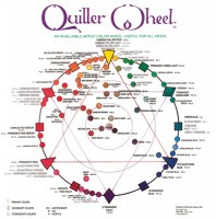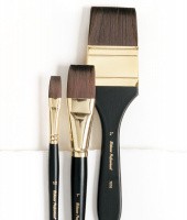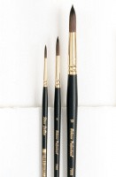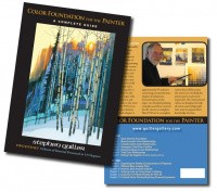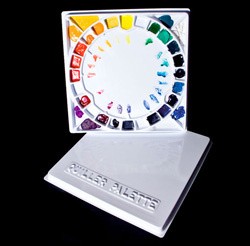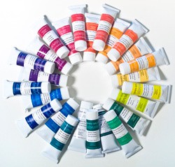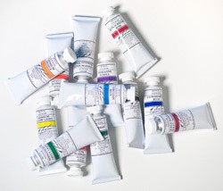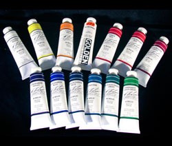
Shop our Online Store for Artists' Supplies
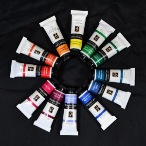
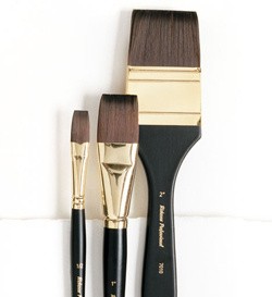
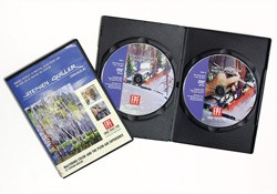
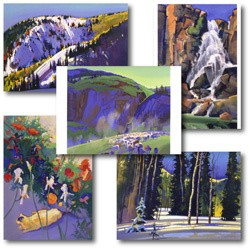
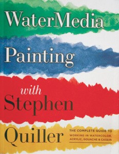
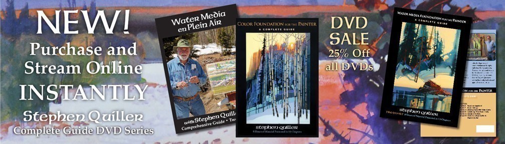
You can make a purchase without stepping foot in the Gallery! Most of the items we offer have something to do with watermedia and color. Please peruse the contents and give these products a try! From our Quiller Color Wheel and DVD Workshops to a variety of paints, brushes, and palettes, the Quiller Gallery's Online store offers top-quality artists supplies -- all tried, tested, used, and RECOMMENDED by Stephen Quiller himself!